


My goodness! My new website is here! After months of planning, rewriting website copy, and choosing the most perfect template (I’m still obsessing over the vibe and layout–more on that later!), we’re finally here, and I am so excited to make use of this little corner of the internet.
Now, this is not just another “let’s pop the champagne and look at all the pretty things I’ve created” type of blog post. I want to share my thought process and the decisions I made in the hopes of helping those of you considering your own rebrand or website refresh. My hope is that you’ll find this post very insightful, and that through it I’ll be able to hand out a few permission slips allowing you to change your “go big or go home” mentality.
Without further ado, let’s get started.
Why did I decide to update my website?
I had gained clarity on who I was serving and what I loved doing, and wanted my website to reflect that.
Believe it or not, I launched my copywriting business using pre-made logos and a run-of-the-mill website template. It didn’t feel special, but it got the job done–within four months, my business took off, and I had to hire help in order to keep up with everything.
I started out with accepting retainer clients for content management work, and would write blog posts, captions, emails–the list goes on! I then pivoted to doing projects and VIP days for website and launch copy. I even did a few coaching sessions (but didn’t enjoy it enough to make it a regular offering). Because of the constant work, I learned a ton about myself, my working style, and the projects and clients I enjoy working with–and I learned that less can be more.
I’ve spent a lot of time this past year refining my existing offers instead of creating new ones. I even “retired” a service that I didn’t 100% love doing. I truly believe that you can do less, but do it better, and that this can lead to more focus and enjoyment.
I realized through this process that my old website just felt janky, and not able to meet my desires. I wanted visitors to be able to identify by themselves which service meets their needs. I wanted potential clients to have a website experience where they felt confident in choosing to work with me before even talking to me. I wanted them to feel hopeful, excited and safe.
My old website didn’t match the taste of my ideal clients.
If you’ve been following me for a while, you know that I don’t really care about making things look pretty. Sure, copy and design go hand in hand. But words are the number one driving factor for communicating my value and selling my stuff. Design simply amplifies it.
But the more I looked at my website and compared it to those of my clients, the more I noticed a major disconnect. EVERY SINGLE ONE of my clients–from Tara Nicole Weddings to Amavi Studio to Arranged by Amber–is polished, put together and has great style. You can tell that these ladies are elevated and classy, and that is something that I really wanted to reflect on my website. First impressions are important, and my bubbly colour palette and basic template website just weren’t cutting it anymore.
With that in mind, I knew that my brand had to become more mature and elevated, and I wanted to create something that is bold and confident while also being editorial and classy. My clients love referring me to their peers and clients, and I feel like I finally have a website that is shareable and pleasing to the eye.
The Manhattan template from the Tonic Site Shop was perfect for this. With the help of Angela from Saffron Avenue, I refreshed my brand with a new colour palette using her workbook that I know is going to attract my target market!
I felt nervous about sending potential clients to my website.
Most people feel embarrassed about their copy, even though they have a pretty website. I’m the opposite.
As my business continued to grow and I started to tap into high-end pricing, I found myself avoiding sending potential clients to my website, having them DM me instead–which was a big red flag! My website is supposed to work FOR me, not be a burden I’m embarrassed of.
Even though my conversion rate was still pretty high, I couldn’t get over the fact that I no longer wanted to send people to my site. I mean come on, I’m a website copywriter! That doesn’t mean that I wasn’t skeptical about a change though–don’t fix what isn’t broken, right? I continually asked myself, “is a refresh really necessary?” And every time the answer was a big YES.
I still believe that you shouldn’t rely purely on pretty visuals to make you money. Your messaging is what matters. If your words are just taking up space instead of converting the right people consistently, pretty branding WON’T fix it, it will only magnify your inability to communicate your value in words. BUT, if you’re at a point where you’re already converting and you know great branding can take things to the next level … DO IT!
A few special features of my new website that I love
The colour palette
This was probably the hardest thing to nail. I work with a lot of creatives (photographers, wedding planners, etc.), and what we often see is that fine, airy, soft look, which just doesn’t feel like me at all.
Angela from Saffron Avenue was so helpful with this. She gave me the confidence I needed to strike a balance between my ideal client’s style and my own personality. I was able to create something that truly reflects the type of audience I want to connect with while still feeling like myself.
My new colour palette is bold, confident, refined and classic. At first I was a little skeptical about the pop of orange, but it has become my favourite! It’s such a fun accent colour.
The blog
I’ve always wanted my website to feel like flipping through a Vogue magazine, so my new blog layout is definitely one of my favourite parts of the site.
It’s simple and editorial, and I feel so inspired to publish more content!
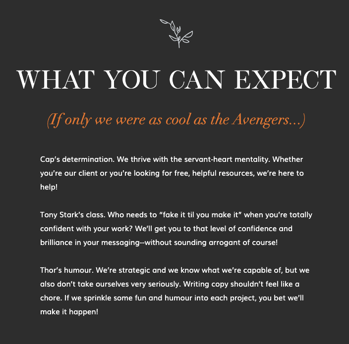
The About page
This is probably my favourite page of the website. I’m a huge Marvel fan, and I had so much fun infusing that aspect of my personality into my copy. It truly sounds like my voice!
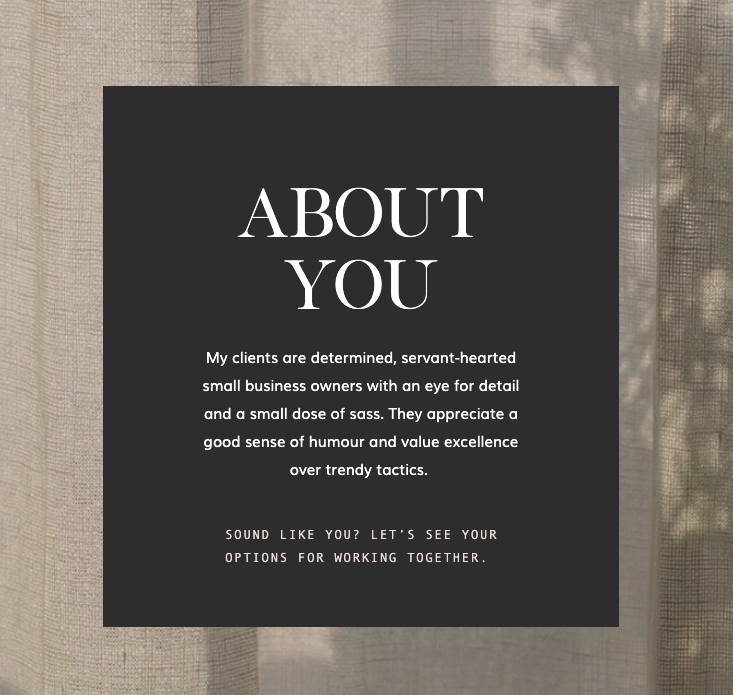
The Services page
On my Services page, I call out EXACTLY who I serve and the type of clients I usually work with: “My clients are determined, servant-hearted small business owners with an eye for detail and a small dose of sass. They appreciate a good sense of humour and value excellence over trendy tactics.”
Don’t be afraid to be ultra-specific about who you serve and how you serve them. It’s okay that you’re not for everyone–I know that I’m not. While I have worked with a variety of clients with very different brand voices and tones, I DO know who I want to serve and I decided that it’s time to make that clear. Is this going to make or break my copy? No. Is this going to help me attract more of the right people? 100%.
—
I hope you enjoy my new website as much as I do. If you’re interested in working together, check out my services here. If you have any questions, leave a comment below!

Comments +